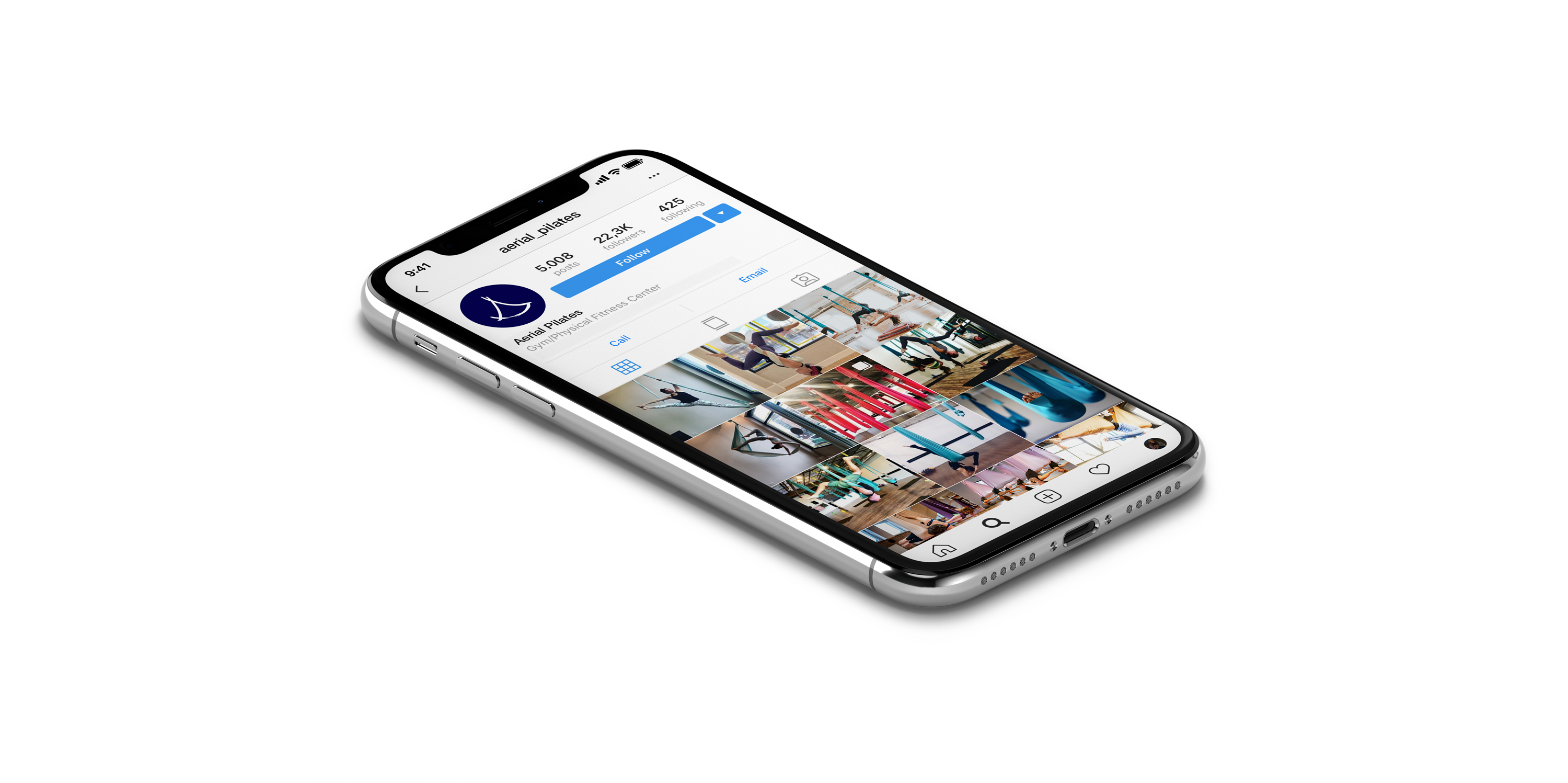
Aerial Pilates
Logo design, 2018
Role: Logo design, concept
My task was to create a logo for an aerial pilates studio network, feminine but not too girly, with flexible and agile character, well-balanced and clear at the same time.
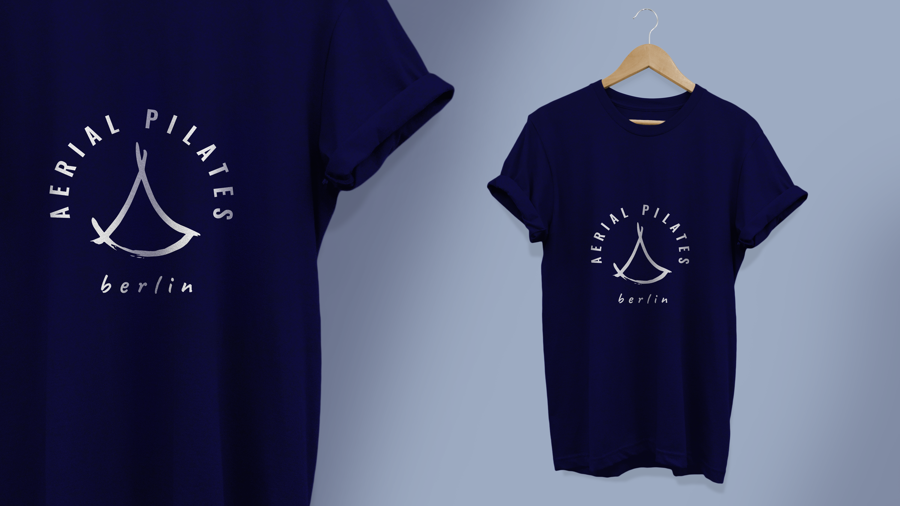
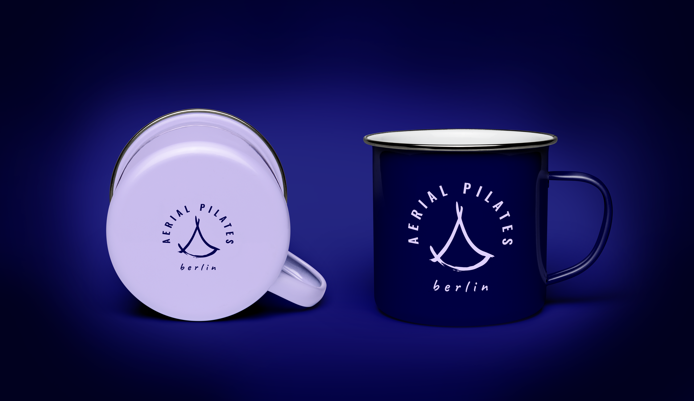
The triangle design of the logo is inspired by the main and most recognizable element of this sport - aerial pilates hammock with its symmetrical triangle form.
Two different fonts are used to show different importance levels of the information. I used geometric and clear sans serif typeface for “Aerial Pilates” - the brands name. Chosen font helps to balance the logo, as the image element of it is drawn by hand, showing the moving and flexible spirit of this activity. “Berlin” and “Hamburg” typography is smaller than “Aerial Pilates” because the city name element is less important and names change from city to city. That is why my choice was a casual scripts typeface, which also helps to make an impression that the names were written quickly. The studio is planning to open its doors in different cities, as mentioned before, so it was important to make the logo fit for this purpose without letting it look overloaded.